I began this project as something “just for fun.” For a few years now, photos taken of the giant Iguanas on the island of Cayo Largo, off the southern coast of Cuba (Iguanas below), have been waiting for an opportunity to realize themselves. SAQA’s call for entry, “Fur, feathers, fangs and fins” seemed the perfect fit!


Here we go: I envisioned a wall mounted work to reflect the rock face with the Iguana basking on a rocky ledge. I had saved a silk fusion “skin” from a previous rock sculpture which was never completed. This I thought would give me a leg up on the project. I had also envisioned some very textured remnants of handwoven fabric from my weaving days, covering the rock face and in fact, the Iguana itself – a perfect camouflage fit.
That aside, I began with the construction of the creature. What to use as an armature? I could see some left over pool noodles as just the right size and nice an squishy to shape the body, but wire was also necessary to keep that shape and to fashion legs and toes – oh those toes! How many are there? I researched on line only to read that they could be anywhere from 3 – 5. I zoomed in on my own photos and determined in the end that the Cuban species had 5 and that was what I would go with.
I built a “cage” around the noodles to flesh out the body; however that would not be enough to support the outer skin. I filled the gaps between with leftover polyester stuffing. This all had to be covered to create a nice even and solid surface onto which I would “dress” the Iguana. I searched through my tape supplies to find a cloth tape that would both smooth and hold everything together quickly without having to wait for drying. When fashioning the rock, I had used both PVA and cellulose paste with strips of cotton and cheesecloth – hours of work and time to wait while it all dried.
This rudimentary Iguana shape took about 3-4 hours to construct and was about life size. Gee, I had looked over the prerequisites for SAQA’s call and recalled a very large window of sizing options, so dismissed that and became immersed in the creative process.


I’m starting to “see” an Iguana and it’s turned out life-size. All has been formed by looking over a selection of my own and some posted images of Cuban Iguanas from Cayo Largo and one of its outlying small islands. Apparently, you can take an excursion there to be among the creatures on the beach! https://www.youtube.com/watch?v=NZFskkl3yEo you might like to check this video out. The face was certainly far from correct, but, understanding anatomy, there has to be an allowance for the eyeballs, so plenty of that space.
The head structure took a little problem solving: I had some silk fusion fabric left over from the “rock” structure, some toy animal eyes, lots of cheesecloth for a cloth version of papier mache and determination. The head was shaped by building up the structure of the skull, mouth and eyes temporarily inserted (they were blue which didn’t work, so that had to be sanded off and painted white – on the back). With a series of pleated silk fusion shapes, handstitched, the head slowly began to take shape.
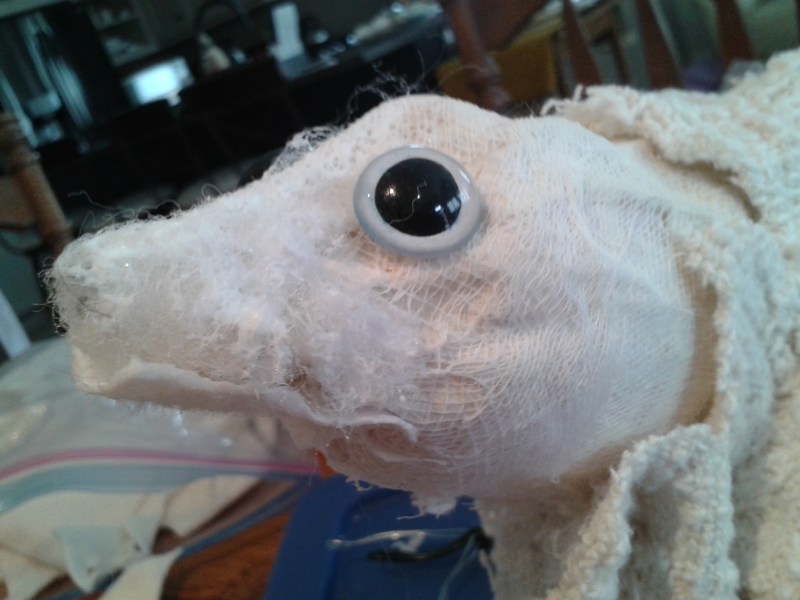
Cheesecloth used to build the skull structure with eye temporarily in place 
Shaping top of the skull 
Pins used to hold all in place 
Hand stitching through silk fusion (silk fibres held together by cellulose paste on fine fabric base).
Now for the actual “dressing” of the Iguana which I am separating in this blog, but during the actual process, both head and skin were developed simultaneously.
A new update on “WordPress” is allowing the descriptions to show on the actual image, so here in sequence, you can now “read” the process. With a combination of stitching by hand and machine, and using PVA glue to adhere the skin to the body structure, the Iguana is beginning to take on an almost “lifelike” form. It’s almost creepy to hold the life size creature. When our children were young, we had a “pet” Iguana. I don’t believe I ever held it!

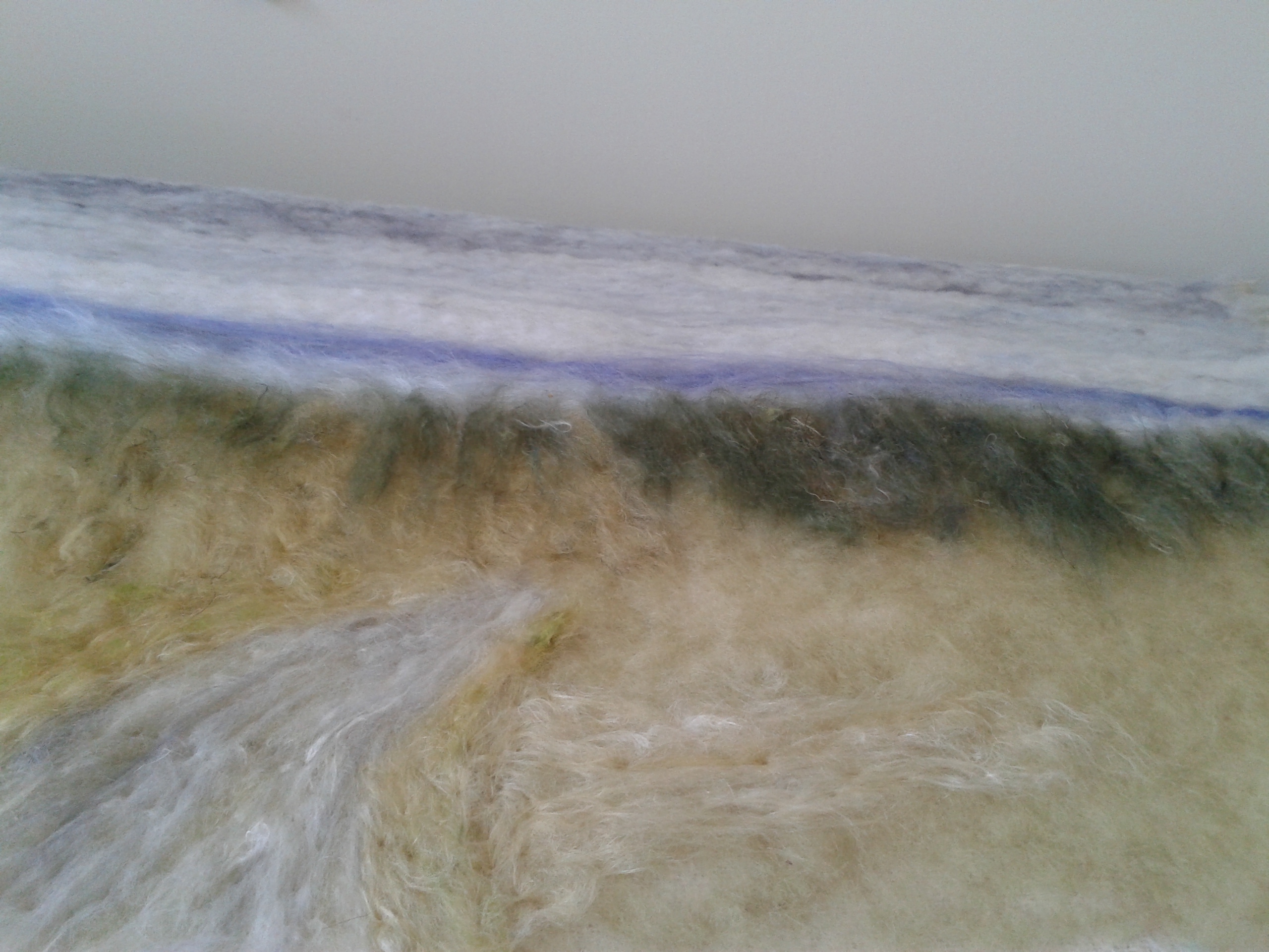
Handwoven, textured cotton fabric 
Skin shape 
Shaping over the body form 
Creating vertical stitched ribs 
Creating the spinal rigde 
Turning ridge into plates 
Shaping the tail